
Making MrPowerScripts.com pretty
I’m not a designer. I have a terrible sense of design really. Though I feel like it has improved considerably over the years. Hopefully, that trend continues. And while I believe through hard work anyone can become great at what they put their mind to some people simply have an innate advantage. That’s okay because collaboration is what makes every project great. I don’t know anyone who built something great by themselves. The Great Pyramid of Giza? The internet? Kim Kardashian’s butt? All of these took the efforts of many to achieve their notoriety. People have always built off the efforts or inspirations of others.
When I need insights and inspirations to guide me on designs I reach out to my buddy Ben Rossi. He’s an exceptional UX designer and general maker of awesome things. I told him I needed to update the look of my blog. It was hastily put together so I could start exploring SEO techniques. Well, now I want it to look pretty, and he was happy to help me by providing some inspiration and tips.
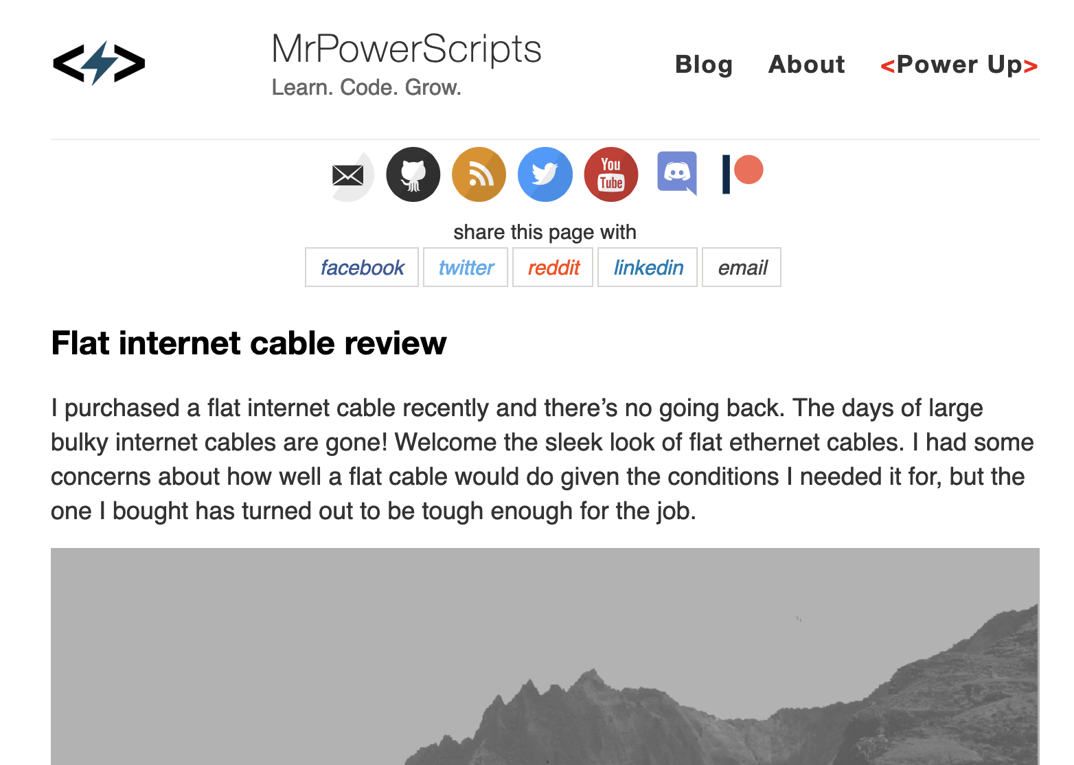
First off, the previous site was incredibly dull. I didn’t utilize color in any meaningful way, and the color I did have came from clashing social icons. He suggested I make things more colorful, and that was a great idea. I need to stop being afraid of using color. MORE color! One of the examples he shared was a website he’s followed for a long time, which is also a blog. I loved it! I played around with some ideas and for the time being I’ve settled with a three-color gradient spanning the entire header. This also creates a nice separation between navigation and content. I’ve removed the social icons for now to simplify the process. I’ll figure out how to merge them back later in a way that blends with the new theme.
Old Design
New Design
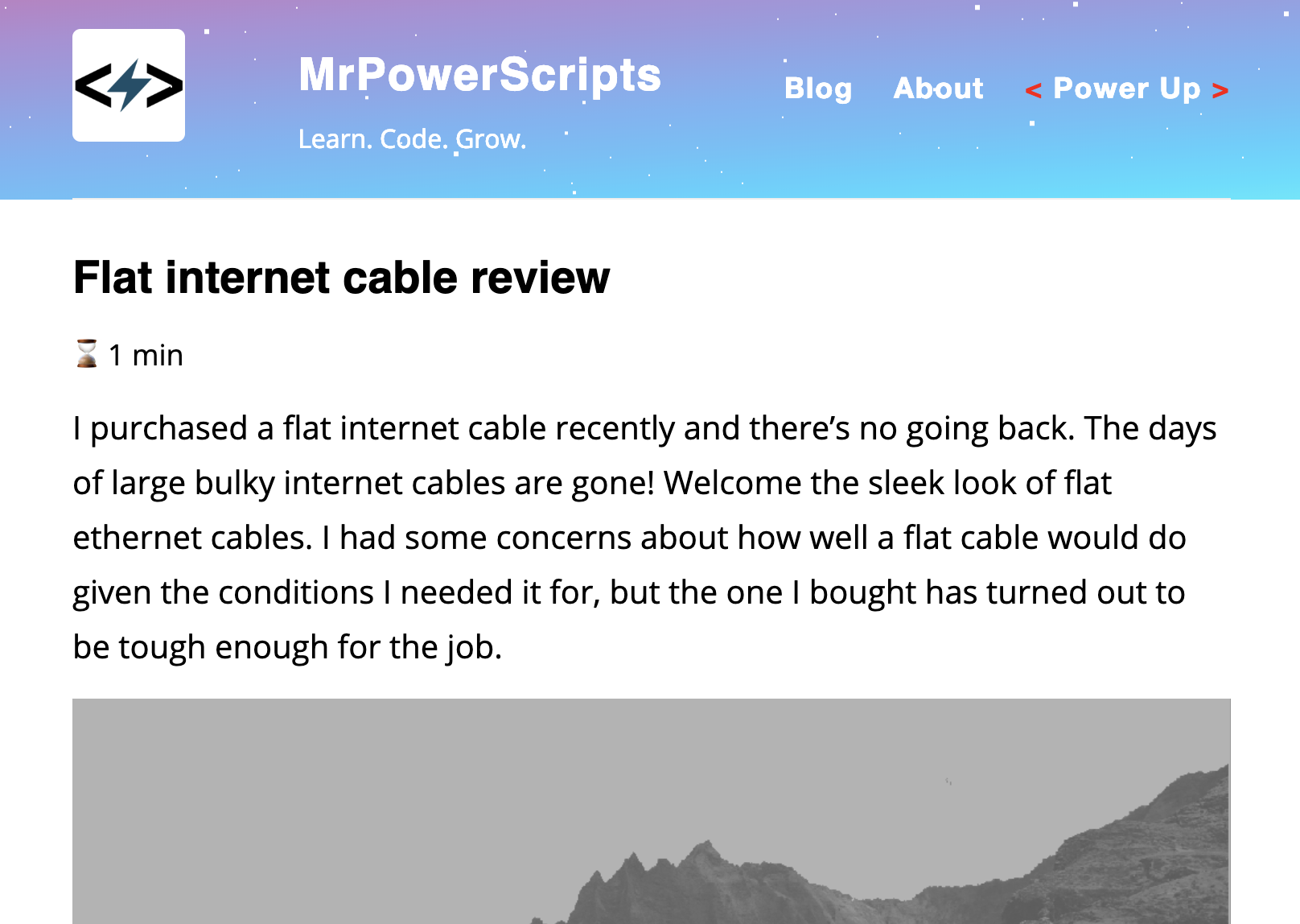
Another suggestion was to adjust the line spacing size and utilize some multiple of 4. I don’t remember why. If I have time to bug him again I’ll go back an ask to update this post. He’s the export and I’m simply taking shade in his shadow. I should also take note to take better notes… later. In the images above you can see the line spacing and font size have been slightly increased, and I have to say to does read better for me!
After adjusting the spacing it was time to give the fonts a bit of love. I did a bit of research on this myself and found some that I truly love. For headings, I went with Montserrat Bold created by Julieta Ulanovsky and inspired by the old posters and signs in the traditional Montserrat neighborhood of Buenos Aires. I was not expecting the font to have a cute story behind it, but there you have it. I love it. For body text, I went with the popular Open Sans created by Steve Matteson. This is a super popular font in recent years and I like the readability of it. I’ve been using it for projects for a long time. I searched around for other options but I don’t see a reason to deviate from what works well here.
Another suggestion was to break the uniformity of my posts on the index page. I had a very strict format which I unwittingly created. I’m definitely a creature of habit and don’t always recognize when i’ve burrowed myself into a cycle. A rigid design pattern in this case. If the post had an associated video to go along with it I would post the video right under the title, and then the post’s introductory paragraph, and then a link to read more. First off, people come to a blog to read, so sticking a video a the beginning seems is a bit nonsensical in hindsight. But I do want to keep the videos on there in the hopes it adds some clicks. What’s the solution?
Once again as suggested from Ben and drawing inspiration from Kottke’s blog I’ve added the videos either somewhere in the middle of the intro paragraphs or at the end. The added benefit of this is offering an opportunity to read some of the posts first before giving the option of clicking the video. Rather than the previous format where the video is already scrolled off the screen (in the case of mobile) before you have a chance to read what it may be about.
I made another small update because of something I found frustrating on mobile. I had a “read more” button that was positioned to the right of the screen. Sometimes I’m using my left hand on mobile and it made it difficult to scroll and select the “read more” button unless I was using my right hand. Now the button spans the entire width of the post. Lefties rejoice! Also, keeping with the new colorful header I changed the color of the button to a much lighter blue. I’m not in love with this as the moment and I’m going to keep experimenting with ideas for the button here. It works tho.
Another small change was adding a space between the post title and the content for metadata. At the moment it only shows an estimated reading time for the post. I’ll be adding some other metadata such as author, post date, and potentially a social sharing option. I still have to figure out how I’m going to work that last one in there.
Finally, how about some animations? This is something I totally stumbled upon without planning. I wanted to add some animations to the “read more” button to make it stand out a bit when I came across the starfield. I added a parallax starfield to the header based on this codepen that I found. Based on… I ripped the code and figured out have to shove it into the header. It kinda reminds me of Goku charging of a spirit bomb, and I think it fits with my “Power Up” page. It’s a bit cheesy, but for now, I enjoy looking at it.
It isn’t perfect. I still need to work on colors, sizing, and adding other elements. I’m much happier looking at the current state than I did before tho. I won’t be taking on any design jobs soon, but thankfully I have great people and inspirations to help me to improve.